
1. Restraint Is Replacing Layered Decoration
The most interesting shift in luxury spirits packaging is subtraction.
For a decade the premium signal was accumulation: foil plus emboss plus a tactile coating plus spot gloss plus a structural reveal. The trouble is that the playbook worked, everyone adopted it, and the result is a shelf where ornate packs are the baseline rather than the exception. Layered decoration now reads as category-standard, and at close range it reads as visually busy. Buyers describe the effect plainly enough, in terms of not knowing where to look and struggling to find the brand name.
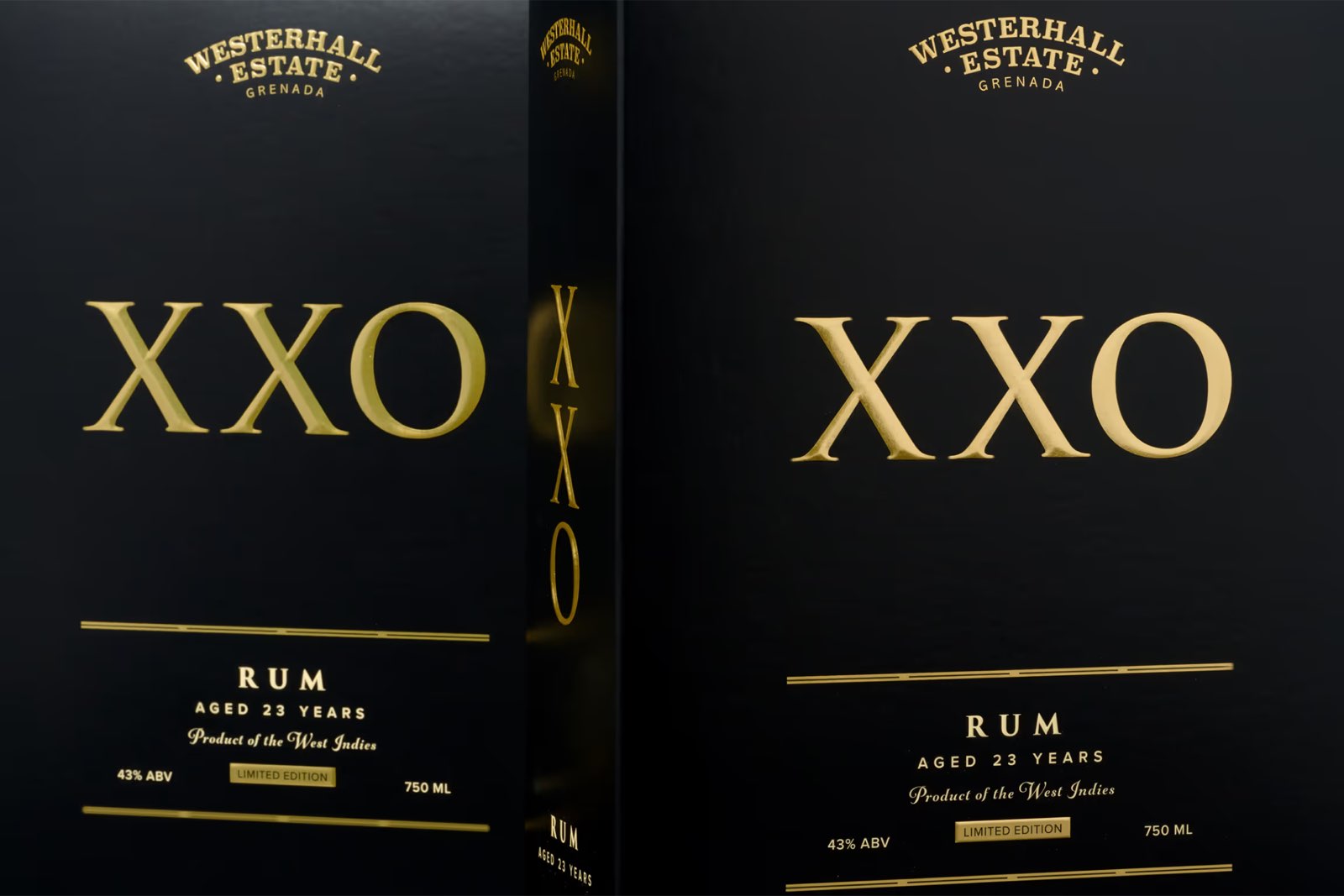
What is replacing it is not minimalism for its own sake. It is a single committed idea, executed precisely: one deep emboss on an otherwise quiet face, one foil element that means something, a structural gesture doing the work that five surface effects used to.
There is a manufacturing consequence worth understanding before committing to this, and it runs against intuition. Restraint raises the execution bar rather than lowering it. Five competing effects hide each other's flaws. One foil element on an uncluttered field has nowhere to hide a registration error, a slight emboss misalignment, or a variation in coating gloss between the start and end of a run. Simple packs are less forgiving, and they expose color drift across a long run more obviously than busy ones do.
That is a reason to choose the supplier carefully, not a reason to avoid the direction. It is also why color management matters more on a restrained pack than an ornate one.
2. Legibility Is Designed for the Aisle, Not the Proof
This is the gap between how packaging is approved and how it is sold, and it is the most consistently underestimated problem in the category.
A pack is judged in a design review under good lighting, at arm's length, on a screen calibrated to flatter it. It is then sold in a retail aisle with mediocre overhead light, or in a back bar that is deliberately dark, at a distance of several meters, next to forty competitors doing the same thing. Designers who work in the category talk about packs that look extraordinary in the render and disappear on shelf, and about clear bottles that go effectively black in bar conditions.
Three practical points follow, and all three are substrate and finish decisions rather than layout decisions.
Contrast Has to Survive Low Light
The separation between a brand mark and its ground usually needs to be greater than looks necessary on a bright screen. Dark-on-dark treatments that read as sophisticated in review collapse into a single mass under weak light.
Mirror Finishes Behave Differently Under Diffuse Light
A mirror foil is spectacular under raking or directional light and can go flat, or read as a dark patch, under diffuse light. A matte or satin treatment gives up peak brilliance but holds its character more consistently across lighting conditions. This is the single most common reason a pack that won its approval meeting underperforms on shelf.
Test Hierarchy at Distance, Not Arm's Length
The first decision a shopper makes about a bottle happens well before they pick it up. Reviewing a pack from across a room, or photographing it under deliberately bad light, catches more real problems than another close-range proof round.
None of this argues against ambition. It argues for choosing the effect that works where the bottle will actually be sold.
3. Texture Is Doing the Work Reflectance Used To
If trend 2 explains why mirror finishes are losing ground, this is what is taking their place. The effects gaining share in the category work on touch and on surface variation rather than on catching a beam of light, which makes them far more stable across the conditions a bottle is actually sold in.
Soft-touch coating produces a matte, low-friction surface that registers in the hand before it registers in the eye. Arkay runs soft-touch as an inline aqueous coating rather than a laminated film, which keeps the carton's recyclability anchored to the paperboard and avoids a separate pass. It comes in a water-based form and a UV form, the UV giving greater rub resistance, and either scuffs more readily than a high-gloss UV, with marks showing most over dark colors.
Spot gloss against a matte ground creates contrast in texture rather than in reflectance. That distinction is what makes it robust in poor light: the effect does not depend on a light source hitting it at the right angle, so it survives a dim aisle in a way a mirror foil does not.
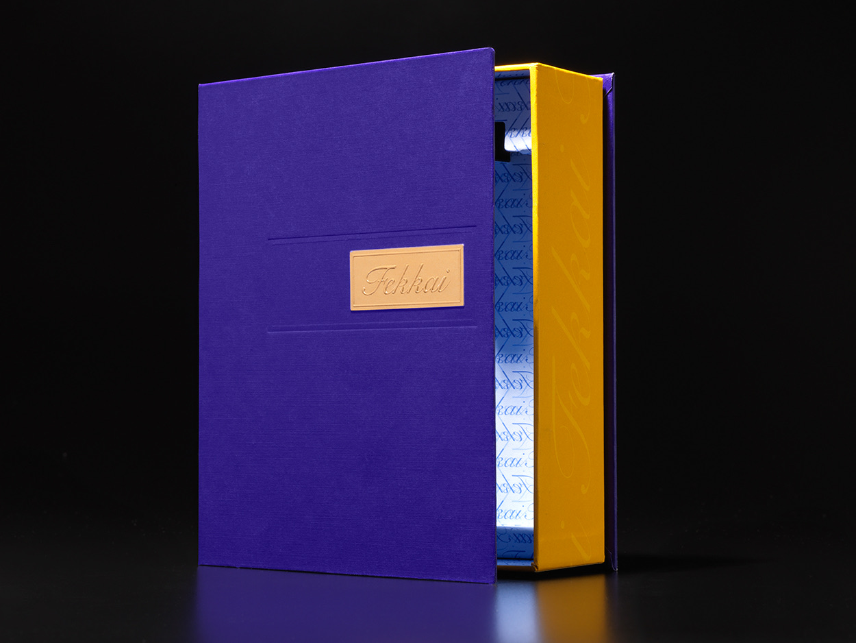
Relief changes the surface itself. Embossing and debossing are geometry rather than an applied layer, which is why they read at any angle and under any light, and it is also why they pair well with a single foil element on an otherwise quiet face.
The through-line is that a texture-led pack is legible in more places than a reflectance-led one. For a category sold across lit retail shelves, dark back bars and courier boxes, that consistency is worth more than a peak that only appears under one lighting condition.
4. Certified Fiber Meets the Premium Brief Without a Trade-Off
Sustainability in spirits is genuinely a tension rather than a solved trade-off, and the material side of it is more forgiving than the anxiety around it suggests.
Certified paperboard takes foil, emboss and specialty coatings with no performance compromise, and sourcing certification under FSC, SFI or PEFC is a chain-of-custody question rather than a performance one. Arkay's board is certified under all three. A brief that asks for certified stock is not asking the design to give anything up.
Recycled content is where real trade-offs live. Recycled fiber is generally less bright and less smooth than virgin board, which changes how a mirror foil or high-gloss varnish reads across a surface. For a design chasing flawless reflectance that is a constraint. For one that wants visible texture and material honesty, it is an asset, where slight variation reads as evidence of provenance rather than as a defect to engineer out.
The useful way to hold this is that certification and performance are separate questions, and only recycled content genuinely trades one against the other.
5. Regulation Has Moved Into the Finish Specification
This is the trend that changed most in 2026, because the regulatory side of sustainability became concrete rather than anticipated.
The EU's Packaging and Packaging Waste Regulation, Regulation (EU) 2025/40, began to apply on a phased basis from 12 August 2026. Because it is a Regulation rather than a Directive, it applies directly across member states instead of being transposed into 27 national versions. For a spirits brand with European distribution that is a simplification: one specification rather than a matrix.
Extended producer responsibility schemes, meanwhile, increasingly set fees by weight and material composition, which quietly converts a packaging decision into a recurring annual cost. The direction of that modulation is worth knowing, because it is not uniformly bad news for a carton. Paperboard consistently sits at the low end of the fee range relative to plastics, and eco-modulation lowers fees for mono-material construction while raising them for non-fiber additions such as laminate films, plastic windows and foil. The mechanism is documented industry-wide; a published per-attribute figure for paperboard is not available, so the direction is clear while the magnitude is not. Our guide to EPR packaging covers how those fees are structured.
The point that catches teams out is compositional rather than aesthetic. The Regulation treats a pack as composite when a second material cannot be separated by hand and amounts to more than 5% of the packaging unit's total mass, and it excludes labels, varnishes, paints, inks, adhesives and lacquers from that calculation. So a laminated film window is a mass calculation rather than a prohibition, and the number is worth running before the feature is cut. Embossing and debossing sit outside the question entirely, since they add no material at all and are geometry rather than a component, which makes them unusually well suited to a brief that wants tactile premium cues without composition consequences.
6. Limited Editions Make Structure the Long Pole
Limited and allocated releases keep growing as a differentiation strategy, and they are the clearest case where packaging carries the proposition rather than supporting it. If a bottle is bought to be kept, the pack is part of what is being kept.
The production reality is where this trend deserves more honesty than it usually gets. The carton is typically the long pole in a dated release, and the printing is rarely the bottleneck. The sequence runs:
- Structural design and dieline development
- Physical samples on the actual substrate
- Artwork and prepress
- Tooling for die-cutting and embossing
- Press run and finishing, with each offline finishing pass adding handling time as well as press time
What compresses under deadline pressure is artwork iteration, provided the structure is locked. What does not compress is tooling and physical sample rounds, because those are manufactured objects rather than files, and no amount of urgency shortens them much.
The practical implication for anyone planning a dated drop is counterintuitive: settle the structure early and leave the graphics open longer. Most programs do the reverse, agreeing the label artwork first and discovering the structural constraints late, which is how a release date starts moving. Our guide to structural packaging design covers what that phase involves.
Genuinely small editions are workable, and they suit startups and emerging brands building toward larger programs. Our work is weighted toward higher-volume and multi-version runs, so fit is a conversation rather than a volume threshold, and Paint on Press is usually what makes a split program viable: up to 20 variations from a single setup.
7. The Presentation Box Has to Earn Its Place
This deserves a straight answer, including from a company that makes the folding cartons and paperboard outers in question.
There is real skepticism about presentation boxes, and it is not unreasonable. The complaint is that a heavy outer box adds cost, adds weight, adds EPR liability, and delivers a moment of presentation that many buyers do not register before recycling it.
Sometimes that is exactly right. A presentation box earns its cost when it is still doing work after the purchase, and there are four situations where it clearly is:
- Gifting. The box is the object being handed over, and the presentation is the product experience.
- Limited and allocated releases. If buyers keep the bottle, they keep the box, and it becomes part of the artifact.
- Travel retail. Packs compete in an unusual environment and often need to survive being carried.
- Direct-to-consumer. When there is no shelf, the box is the entire arrival experience, and it also has to survive a courier rather than a shelf.
That last case is growing fastest, and it changes the brief. A carton designed for a lit shelf is judged on how it looks at three meters; a carton shipped to a door is judged on how it looks at arm's length, after transit, in whatever light the buyer happens to be standing in. Those are different specifications.
Where a presentation box earns least is a standard retail SKU bought for near-term consumption. There the outer box is largely a shelf-presence device, and that job can often be done better by the primary carton itself, at lower cost and lower weight.
The test worth applying is simple: is this box doing anything after the sale? If the honest answer is that it goes into recycling on the way home, the budget usually performs better spent on the surface that does the selling. That is not an argument against presentation packaging. It is an argument for spending it where the occasion justifies it.
8. Structure Is Carrying the Story Surface Used to Tell
Provenance and craft are the category's oldest selling points, and the default way to communicate them is on the surface: heritage marks, founding dates, cask language, illustration.
The shift worth watching is toward communicating the same things structurally. A reveal sequence that slows the opening. An unexpected material meeting where two surfaces join. A format that makes the bottle feel presented rather than contained. These register before any copy is read, which matters because most purchase decisions in this category are made at a distance and at speed.
Structure also has a credibility advantage that surface decoration has lost. Claims of craft printed on a pack are claims; a carton that visibly took effort to make is evidence. In a category where the audience has grown skeptical of premium signaling, that difference is doing real work.
How Arkay Produces Luxury Spirits Packaging
Arkay was founded in 1922 and is now in the fourth generation of family ownership, producing folding cartons for premium and mid-market brands across beauty, personal care, food and nutraceuticals, lifestyle goods and spirits. The spirits work leans hardest on the finishing capability: hot and cold foil, embossing and debossing, specialty coatings and spot varnishes, all executed in-house rather than passed to finishing subcontractors, which keeps the approved proof and the production run under one set of controls.
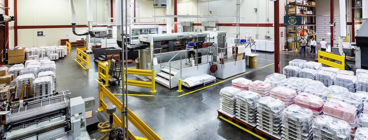
Arkay is a CarbonNeutral® certified company, and every carton is produced at our 140,000 sq. ft. Roanoke, Virginia facility on paperboard certified under FSC, SFI and PEFC. Color is held with G7 color management and Paint on Press, Arkay's proprietary process developed under Chairman Emeritus Howard Kaneff, which matters most on exactly the restrained packs described in trend 1, where drift has nowhere to hide. Our Hauppauge Design Studio typically moves from a first concept to a physical mock-up within a week, and as fast as a day when urgency demands it, depending on the project, produced on the substrate and finishing the run will ship on.
One example is Courage & Conviction, the American single malt distilled in the Blue Ridge Mountains, whose carton Arkay produces in the same range of Virginia.
Domestic production matters more in this category than in most, because spirits releases are dated. Bottling schedules, distributor cutoffs and holiday windows do not move, and taking the ocean-freight leg out of the schedule significantly reduces one of the largest sources of timing risk.
Plan Your Next Spirits Release With Us
Let's talk about the right carton for your release. If you have a dated drop on the calendar and want to know what a structure will actually take to produce, brief us on the release.
Frequently Asked Questions
What is driving packaging changes for luxury spirits in 2026?
Three pressures, pulling in different directions. Regulation is the firmest: the EU's Packaging and Packaging Waste Regulation began applying on a phased basis from 12 August 2026, replacing a directive that had been transposed into 27 national variations, so a brand shipping across Europe now designs against one specification rather than a matrix. Extended producer responsibility schemes increasingly price packaging by weight and material, which turns a finish decision into a recurring cost. The second pressure is commercial: premium cues have converged so thoroughly that dark palettes, heavy serifs and metallic accents no longer differentiate anything. The third is practical, as more spirits are bought online and a carton designed for a lit shelf has to survive a courier instead.
How can a craft distillery compete on shelf with a major spirits house?
Not by matching their finishing budget, which is unwinnable, but by being legible where they are ornate. Large houses tend toward layered decoration because it signals investment, and the practical result is packs that are visually busy at close range and indistinct from three meters. A smaller brand that commits to one strong structural or finishing idea, executed precisely, reads more clearly at the distance shoppers actually make decisions from. This favors smaller producers in one specific way: a single deliberate effect on an uncluttered face costs less than five competing effects and usually outperforms them. The constraint is that precision becomes non-negotiable, because restraint leaves nowhere for a registration error to hide.
Does a presentation box actually earn its cost on a spirits release?
Sometimes, and it is worth being honest about when it does not. A presentation box earns its place when the purchase occasion is gifting, when the bottle is a limited or allocated release that buyers keep, when the pack has to perform in travel retail, or when the product is sold online and the box is the entire arrival experience. It earns much less on a standard shelf SKU bought for immediate consumption, where it adds cost, weight and EPR liability for a moment of presentation few buyers register. The useful test is whether the box is doing work after purchase. If the answer is that it gets recycled on the way home, the money is usually better spent on the carton that does the selling.
How do you keep a spirits carton legible in poor retail and bar lighting?
By designing for the environment rather than the proof. Packs are approved under studio lighting and then sold in dim retail aisles and much dimmer back bars, where dark palettes collapse into each other and fine reversed-out type disappears. Three things help. Contrast between the brand mark and its ground has to be strong enough to survive low light, which usually means more separation than looks necessary on screen. Finish behavior matters, because a mirror foil reads brilliantly under raking light and goes flat or black under diffuse light, while a matte or satin treatment holds its value more consistently. And hierarchy should be tested at distance, not at arm's length, since the first decision a shopper makes about a bottle happens several meters away.
How long does a limited-edition spirits carton program take to produce?
It varies by complexity, and the honest answer is that the carton is usually the long pole rather than the printing. Structural design and dieline development come first, then physical samples on the actual substrate, then artwork and prepress, then tooling for any die-cutting or embossing, then the press run and finishing. Each additional offline finishing pass adds handling time as well as press time. What compresses well is artwork iteration and approval, provided the structure is settled early. What does not compress is tooling and physical sample rounds, because both are made things rather than files. The practical implication for a dated release is to lock structure first and leave graphic decisions open longer, which is the opposite of how most programs run.
Can sustainable materials hold a premium finish on a spirits carton?
Largely yes, with the caveats sitting in specific combinations rather than in the category. Certified virgin paperboard takes foil, emboss and specialty coatings with no performance compromise, and sourcing certification under FSC, SFI or PEFC is a chain-of-custody question rather than a performance one. Recycled content is where the trade-offs appear: recycled fiber tends to be less bright and less smooth, which affects how a mirror foil or a high-gloss varnish reads, though it can suit a design that wants texture. The more consequential point for 2026 is regulatory rather than aesthetic. A non-fiber addition such as a laminated film window counts toward the composite-packaging threshold once it exceeds 5% of the pack's total mass, while labels, inks, varnishes, adhesives and lacquers are excluded from that calculation, so the finish specification now carries compliance weight as well as visual weight.
Sources
- EUR-Lex: Regulation (EU) 2025/40 of the European Parliament and of the Council of 19 December 2024 on packaging and packaging waste. https://eur-lex.europa.eu/eli/reg/2025/40/oj/eng
- European Commission, 11 August 2026: New EU rules on packaging enter into application, confirming phased application from 12 August 2026. https://environment.ec.europa.eu/news/new-eu-rules-packaging-enter-application-2026-08-11_en
- Altstoff Recycling Austria, guidance on the Packaging and Packaging Waste Regulation: the composite-packaging definition, its exclusions for inks, varnishes, adhesives and lacquers, and the mass threshold. https://www.ara.at/uploads/Dokumente/PPWR_Leitfaden/ARA-PPWR-Leitfaden_Englisch.pdf
- Forest Stewardship Council: chain-of-custody certification and label requirements. https://fsc.org/en/label