
What Is Inclusive Packaging?
Inclusive packaging is packaging designed for the full range of people who will handle it: People with limited strength or dexterity, low vision or blindness, cognitive differences, and older shoppers, along with everyone opening a pack in a hurry. The goal is independence. A person should be able to open the carton, read what it is, and use the product without tools and without asking someone else.
On a folding carton, that comes down to three jobs. The carton has to open with little force from an obvious starting point. Its key information has to be readable at a glance. And where sight can’t be relied on, the product has to be identifiable by touch.
Inclusive packaging is related to, but different from, frustration-free packaging, which centers on ease of opening and reduced material for every shopper, especially in e-commerce shipping. Inclusive packaging starts from user needs, so it also covers legibility, identification and touch.
Why Inclusive Packaging Matters
Plenty of shoppers keep scissors next to the recycling bin for one reason: The carton has nothing to grasp. The flap is glued flush, the tear line won’t tear, and the product name is printed in pale type on a glossy panel. For someone with arthritis or low vision, that pack stays shut until someone else opens it.
That group is large. A 2023 CDC report estimates that 53.2 million US adults have diagnosed arthritis, and a 2019 World Health Organization report puts the number of people living with a vision impairment at 2.2 billion or more worldwide. The business case follows: In a 2016 Nielsen survey cited by the Arthritis Foundation, 72% of consumers said they would switch brands for a product or package certified as easy to use, which puts ease of opening on the list of reasons a shopper picks one carton over another.
Principles of Inclusive Packaging Design
Four principles sit behind every inclusive pack. They come from inclusive design practice more broadly, and each one changes how a carton is briefed.
1. Design for Independence
The test of an inclusive carton is whether a person can use it alone. That shifts the question from “Does it open?” to “Can someone with a weak grip, or who cannot see the panel, open it without help?”
2. Start From the People Most Likely to Be Excluded
Inclusive design begins by asking who a pack leaves out, then designing for them from the first sketch rather than adding fixes at the end. Solving for one group usually extends to many: A carton that opens easily with arthritic hands also opens easily with wet or full hands.
3. Offer More Than One Way to Understand the Pack
Information should reach people through more than one sense. Large, high-contrast type serves low vision; tactile marks and braille serve touch; a scannable code can serve a screen reader. When one channel fails, another still works.
4. Prove It in Real Hands
A feature only counts if people can use it. Inclusive packaging is tested with the people it is designed for, and revised before tooling, not after launch.
Main Features of Inclusive Packaging
The principles turn into three groups of features on a folding carton.
Easy to Open
Most failed openings fail at the first move. When a shopper says there is “nothing to grasp,” the fix is structural: A die-cut finger cutout in front of the tuck flap, a small extension on the flap edge that sits proud of the panel, or a notch that gives a fingertip somewhere to go. Mark the opening point too, with an arrow or a contrasting band.
A tear strip only helps if it finishes the job. The Arthritis Foundation’s Ease of Use guide for boxes recommends a grasp area of roughly 0.5 by 1 inch that is free of adhesive, so a weak pinch can hold it, and a strip that comes away in one continuous motion. The same guide recommends that lifting a lid or flap should take no more than 3 pounds of force, a little less than the weight of a full 1.5-liter water bottle. A tuck flap with a tight friction lock can easily exceed that. If the product is used over weeks, the carton also has to close again, so tuck flaps should lift without tearing.
Easy opening has to be balanced against two other jobs. A tamper-evident carton must show it has been opened, and a child-resistant package must stop young children. Both can coexist with accessibility when designed together: US child-resistant testing already requires that at least 90% of a panel of 100 adults aged 50 to 70 can open and use the package correctly.
Easy to Read
Legibility on a carton is a print and finishing decision as much as a typography one. Clear-print guidance for documents recommends 12-point type as a minimum and 14-point where possible, in a plain sans serif. A carton rarely has room for that everywhere, so spend the size budget on the product name, the variant, and the key directions. Judge size by the height of the lowercase letters, called x-height, because two fonts at the same point size can look very different.
Contrast matters more than color. Readers with low vision distinguish light from dark far better than one hue from another, so navy type on a black panel fails even though the colors differ, and red against green is the pairing most color-blind shoppers confuse. Finish matters too: High-gloss coatings and metallic foil reflect store lighting and can wash out small type, so keep essential text on matte areas, using a matte aqueous coating behind directions.
Identifiable by Touch
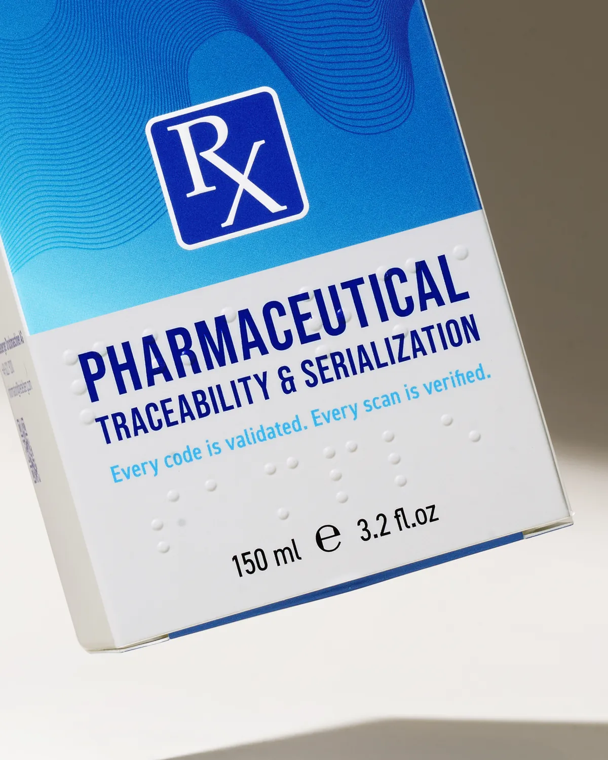
Braille on a carton is raised paperboard, not ink. The dots are pressed up from the back of the board between a raised die and a matching recessed one. Some converters build the braille tooling into the die cutting step; others add an in-line embossing unit to the folder-gluer, so braille is formed after cutting with its own depth control. Either way, the dots have to stay readable after the carton has been folded, glued, packed and shipped, so braille cells stay off creases, glue flaps, and the zone the folder-gluer belts press on, and dot height is verified after converting rather than on a flat sheet.
For medicine cartons sold in Europe, the reference is EN ISO 17351, which favors Marburg Medium, a convention for dot size and spacing designed to be easy to read on packaging. Tactile cues go well beyond braille. An embossed symbol can separate a cleanser from a moisturizer by touch, a notch die-cut into a flap edge can mark a variant, and embossing and debossing can signal where to grip or open. For certain hazardous products sold to the public in Europe, a raised tactile warning triangle conforming to ISO 11683 is mandatory.
Inclusive Packaging Design Strategies
These strategies put the principles and features into practice, roughly in the order a carton project runs:
- Name the users in the brief: Write down who must be able to use the pack, including people with limited dexterity and low vision, and what they must be able to do.
- Set measurable targets: Put opening force, grasp area, and minimum type size in the specification, so they can be checked rather than debated.
- Design the opening into the dieline: Place the thumb notch, finger cutout, or tear strip during structural design, where it costs least to change.
- Make the starting point obvious: Use an arrow, a contrasting band, or a tactile mark so nobody has to hunt for where to open.
- Build a clear information hierarchy: Give the product name, variant, and key directions the most size and contrast on the panel.
- Keep essential text on matte, high-contrast areas: Reserve gloss and foil for brand moments, away from the words people need to read.
- Add tactile identification: Use embossed symbols, notches, or braille so products and variants can be told apart by touch.
- Keep placement consistent across a range: If the product name always sits in the same place, a shopper with low vision learns where to look.
- Check the rules for each market: Confirm braille, tactile warning, and accessibility requirements before artwork is locked.
- Prototype and test with real people: Build physical mock-ups through packaging prototyping, measure the forces against the targets, watch testers with limited dexterity and low vision make their first unaided attempt, and revise before tooling.
For an outside verdict, the Arthritis Foundation’s Ease of Use certification can start at the prototype stage and combines lab evaluation with human performance testing; ISO 17480, the international standard on ease of opening, describes the same two kinds of evaluation.
Which Requirements Are Law and Which Are Voluntary
Most of inclusive packaging is good design rather than law. The legal requirements are narrow and depend on the product and the market.
For brands shipping technology and electronics packaging into Europe, the Accessibility Act is the line most likely to be missed, because it reaches the box and not only the device. For US medicines and OTC products, the carton’s legal obligations sit elsewhere, covered in our guide to pharmaceutical packaging requirements. Requirements change and vary by category, so confirm the rules for each market with regulatory counsel before the artwork is locked.
How Arkay Builds Accessibility Into Carton Development
Accessibility is easiest and least costly to get right before the dieline is final, so at Arkay it belongs in the first structural and finishing conversations rather than at artwork sign-off. Founded in 1922 and now in its fourth generation of family ownership, Arkay works alongside brand and design teams to make those decisions while they are still easy to change.
Structural packaging design is where opening features are decided: The position of a thumb notch, the direction of a tear strip, the lock that has to stay secure on the line and still lift easily at home. Arkay’s Design Studio in Hauppauge, New York, can turn a concept into a physical mock-up typically within one week, and in as little as one day when a project is urgent, depending on its needs. That puts a real carton in a tester’s hands before anything is tooled.
Finishing is where legibility and touch are decided. Arkay embosses and debosses to a registration tolerance of ±0.3mm, which means a tactile mark lands where the artwork puts it rather than drifting off the symbol it sits on. Its solid bleached sulfate board runs from 14 to 28pt (0.014 to 0.028 inch thick, the top of the range just under the thickness of a credit card), with 18pt and above typical for embossing, so the board can hold relief without cracking. Inline soft-touch aqueous coating gives essential text a low-glare surface, and G7 color management holds contrast consistent from run to run. The full range of Arkay’s capabilities brings print, finishing and converting under one roof in Roanoke, Virginia.
Design a Carton Every Customer Can Open and Read
Let’s talk about who needs to use your packaging and what they need to do with it. Bring the product, the markets and the people you’re designing for, and our team will work through the structure and finish with you before anything is tooled. Start the conversation with Arkay.